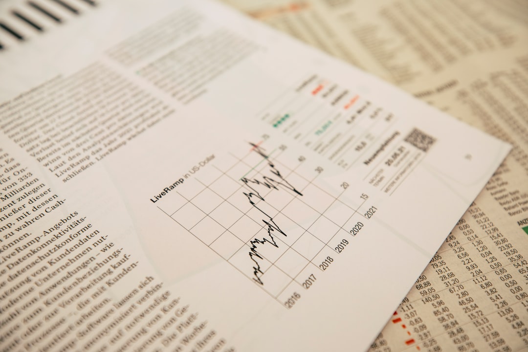
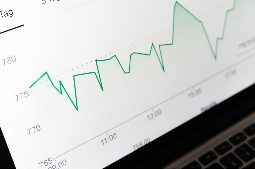
A line graph is a type of chart that shows how a particular variable changes over time. The y-axis on a line graph represents the variable that is being measured, while the x-axis represents time. Points are plotted on the graph to represent the value of the variable at different points in time. A line is then drawn between these points, which shows the change in the variable over time. If you’re interested in learning more about line graphs or want to see an example of a line graph in real-life application, then you can keep reading below to learn more about these line charts.
What is a line graph?
A line graph is a graphical representation of data, in which points are connected by lines. The data can be displayed as a series of points, connected by lines, or it can be displayed as a series of lines, connected by points. Line graphs are used to display trends in data, and they can be used to compare data between different points in time. Line graphs are used to show how a variable changes over a specific time period. The x-axis can represent time, while the y-axis represents the variable. A line is drawn between each data point, showing the change in the variable over time.
When should you use a line graph?
A line graph is a type of graph that shows how a variable changes over time. It consists of one or more lines that connect data points. The x-axis shows the time period, and the y-axis shows the value of the variable. There are several situations when you might want to use a line graph. For example, you can use it to track the progress of a project over time. You can also use it to compare the sales of two products in a quarter. It can be used to show the change in temperature or track the stock market. It’s useful for tracking a time-dependent variable, keeping an eye on trends, and spotting patterns between different variables.
Are there different types of line graphs?

There are plenty of different variants to the line chart. For example, there’s the multi-series line chart, the multi-axis line chart, as well as the step line chart, the zoom line chart, and the scroll line chart. There’s also the spline chart. Each one can be used in a different context. A multi-axis chart, for example, can plot temperature against precipitation. Meanwhile, a step line chart is great for showing intermittent production cycles or admission rates to a college or university.
What are some disadvantages to using a line graph?
Line graphs are often used to display changes in data over time. They are created by plotting points on a graph, connecting them with a line, then measuring the slope of the line. While line graphs are often used to display data, they have some disadvantages. The first disadvantage of line graphs is that they can be difficult to read. The points on the graph may be difficult to see, and the line may be difficult to follow. This can make it difficult to determine the slope of the line and to understand the data that is being displayed. Another disadvantage of line graphs is that they can be misleading. The slope of the line can be misleading if the points are not evenly spaced or if there is a lot of noise in the data. This can make it difficult to understand the data that is being displayed. Finally, line graphs can be time-consuming to create. The points on the graph need to be plotted carefully, and the line needs to be drawn accurately. This can take a lot of time and effort.
Now that you know what a line graph is, you’ll know when to use it to communicate your data effectively.

